Triple Tack

Triple Tack

Brand · Identity · Design · App · Website

Visit the website
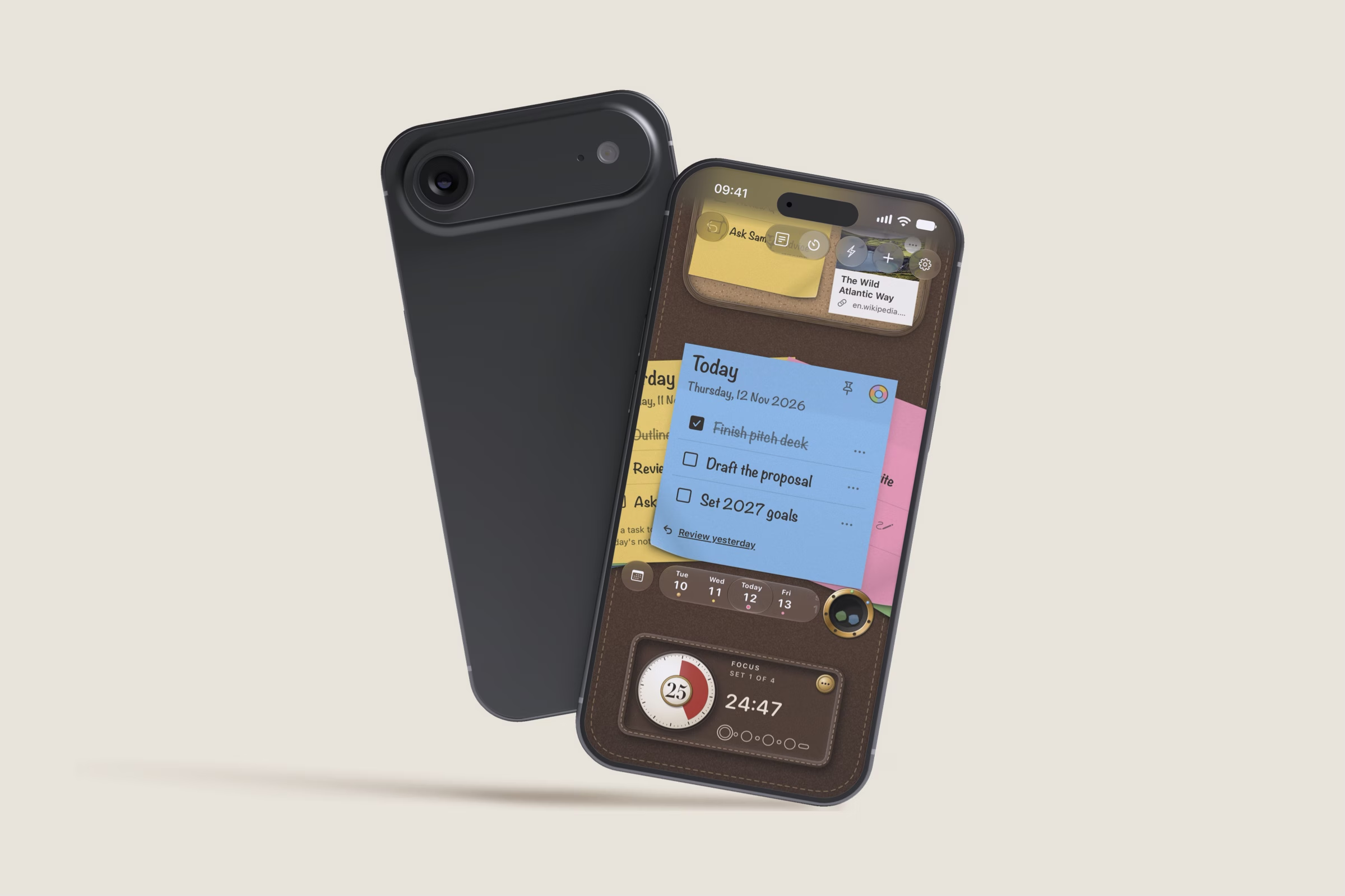
Triple Tack open on an iPhone Duo folded like a book, with a cork board on one side and today’s sticky note on the other, beside an iPhone.

The challenge

Most to-do lists only grow. Every email and message adds another line, and the things that really matter get buried. A sticky note on your desk works the other way. It holds only what matters, it stays where you can see it, and crossing a line through it feels like progress. Aidan wanted to bring that quiet joy to iPhone with Triple Tack. With the launch of iPhone Duo it could go further, opening up like a whole desk that’s yours to enjoy however you hold it. The idea was simple. An app worth paying for, built on a medium everyone already knows, with nothing new to learn.

The approach

Triple Tack is built on one belief. More isn’t always better. Three well-chosen things can move your day further than an endless list, so each day gets a sticky with three lines. Everything else borrows from habits people already have. Ideas wait on a pinboard until their day comes, and an unfinished to-do moves on to tomorrow, just as it would on paper. Every idea went from sketch to prototype, through rounds of testing and feedback, before it was built. Every interaction was designed to feel natural and delightful, right down to scrunching up a finished note and throwing it away. And like a note on your desk, it’s always in view, on the Lock Screen and in the Dynamic Island, a gentle reminder of what matters today.

The result

Triple Tack is coming to the App Store, a native app that feels at home on iPhone and iPhone Duo. Today’s sticky sits on the Lock Screen, in the Dynamic Island and on the Home Screen, with a focus timer for the big one and Siri for when it’s easier to say it. Everyone makes it their own from the first minute, choosing the desk’s leather, the pinboard, bright or soft paper, and where finished notes go, from a well to a spike to a flight of paper cranes. Privacy was a priority from the start, so nothing anyone writes leaves their iPhone. The brand is tactile and grounded in the real thing. A sticky note folded into a T, bold, playful type, and three multicoloured notes for a dash of colour and delight. A marketing website, tripletack.com, brings the design and the benefits to life. An email waitlist and a weekly letter keep people close, from the first sign-up to launch day and beyond.

Got a project in mind?

Share the gist. Tell us what you’re trying to grow, what’s in the way, and we’ll take it from there.